Improving seller engagement on a popular classified ads platform
I drove the development of user-centred solutions that met the business objectives and provided value to its users.
Put sellers in the driver's seat
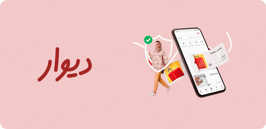
Divar is the largest classified ads platform in Iran with millions of users buying and selling a wide variety of goods. The platform offers various features, including a search function, filtering options, and the ability to create and manage store profiles. Divar introduced a new feature that allows store owners to sell their goods.

Designing for business objectives and user needs
My role was to advise on ways to encourage more merchant posts on their pages, notify users of the existence of store profiles, and increase seller activity resulting in more revenue. This involved conducting research to identify the key user needs and pain points, and then designing and testing potential solutions that addressed those needs.
I guided the design and ranking logic, and ensured that the feature was optimized for a seamless user experience. I also tracked key metrics and analyzed data to evaluate the success of the feature and identify areas for further improvement.


The low post problem for users and store owners
Although the app has many active users, the average number of posts in each store is low, leading to a lack of visibility and engagement with users. This problem affects both store owners and users, as fewer posts mean that buyers have limited options, while store owners struggle to attract potential customers to their pages.
Boosting seller activity and user engagement
To measure the success of the new feature, we tracked the following metrics:
The average number of posts in each store increased by 30%, indicating an increase in seller activity.
The number of active store profiles increased by 20%.
Store profile views increased by 40%, and the number of active store profiles increased by 20% leading to an overall increase in sales of 25%.
The number of laddered posts(Promoted posts) and new stores created also increased by 10% and 15%, respectively.
After the feature was introduced, we saw significant improvements in all metrics.
Making trade-offs to drive revenue and engagement
There were several challenges in this case study, including:
- Encouraging merchants to post more frequently: One of the main challenges was to encourage store owners to post more frequently on their pages. This required us to identify the reasons why store owners were not posting as frequently as we would like, and to develop strategies to overcome these barriers. We conducted user research to better understand the motivations and challenges faced by store owners, and used this information to inform our design decisions.
- Increasing seller activity: Another challenge was to increase seller activity on the platform. This required us to design features that would encourage sellers to be more active, and to create a ranking system that would incentivize them to post more frequently. We considered several different ranking systems, and ultimately settled on a system that would reward sellers for high-quality posts and consistent activity.
- Notifying users of store profiles: Another challenge was to ensure that users were aware of the existence of store profiles, and to encourage them to view these profiles. We conducted user research to understand why users might not be aware of these profiles, and used this information to design a more prominent placement for store profiles within the app.
Overall, the key to overcoming these challenges was to remain focused on the needs of our users and to constantly iterate and refine our designs based on their feedback. By doing so, we were able to create a more effective and engaging platform for both store owners and users, ultimately resulting in increased revenue for the app.
User-centric design in action

The design process began with a deep analysis of user behaviour on the app and a review of user feedback. We wanted to identify pain points for both users and store owners and determine how we could address these issues through the new feature. We conducted user interviews, surveys, and focus groups to gather insights on how users interacted with store profiles and what features they would like to see added to the app. After analyzing this data, we developed several potential solutions and evaluated them based on a set of criteria, including:
- Effectiveness: How well does the solution address the identified user pain points and meet the project goals?
- Feasibility: Is the solution technically feasible within the app's existing infrastructure and design?
- Scalability: Can the solution be easily scaled to accommodate a large number of store owners and users?
- User Experience: How easy is the solution for users to understand and use? Will it enhance the overall user experience on the app?
- Revenue Potential: Will the solution drive additional revenue for the app and store owners?
After evaluating each potential solution based on these criteria, we identified the most promising solution and began developing a prototype. We then conducted user testing on the prototype, gathering feedback from users to refine the design and ranking logic. Through an iterative design process, we continued to refine the feature until we arrived at the final design.
In terms of selecting the best solution, we ultimately chose the solution that was most effective in addressing user pain points and meeting the project goals. This solution was also technically feasible and scalable, enhancing the overall user experience on the app while also driving additional revenue for the app and store owners. We relied on user feedback and data-driven insights to evaluate the success of the solution and make adjustments as necessary to ensure its ongoing effectiveness.
To achieve the project's goals, the design team proposed a new feature that would encourage store owners to make more posts on their pages. The feature involved introducing a ranking logic that highlighted the most active stores and their posts. The ranking system took into account several factors, such as the number of posts, the frequency of posts, and user engagement. By displaying the most active stores and their posts on the app's home page, the design team hoped to encourage other store owners to be more active on the app. To increase visibility, the team proposed notifying users of the existence of store profiles. The feature involved displaying store profiles as a separate category on the app's home page and adding a notification system that notified users of new store profiles in their area.
Overall, the design process was a collaborative effort involving input from various stakeholders, including app developers, designers, product managers, and user experience researchers. By working together and utilizing a data-driven approach, we were able to identify the most effective solution and implement it successfully on the app.
To determine which stores to showcase on the homepage, we used the following ranking logic:
- Stores with at least 20 active posts were included
- Stores with at least one post in the searched category were shown in the list
- Stores were sorted in descending order by the number of their activity, which is calculated as (published posts in the searched category in the last ten days) + (laddered posts in the searched category in 10 days)
- Laddering: Stores could pay to shift their post to the top of the post list
If the number of remaining stores was less than five, the list of stores would not be displayed. If two or more stores had an equal number of activities, we sorted them by the time of their activity, with priority given to stores that are closer to the present. This list is refreshed every 24 hours.
Unveiling user needs
We conducted a series of user interviews with store owners to understand the challenges they faced in posting more frequently. We found that store owners were often unaware of the benefits of creating a store profile and struggled to attract new customers due to low visibility on the platform. We also conducted user testing sessions to understand how users interacted with the app and discovered that many users were unaware of store profiles and did not know that they could view all store posts on their profile page.
From usability testing to metrics analysis
The testing process for this case study involved several steps:
- Usability testing: During the usability testing phase, we recruited a diverse group of participants to represent the target audience of the app. We provided them with a set of tasks to complete, such as creating a store profile, adding items to their inventory, and promoting their store to potential buyers. We observed their behavior and recorded their feedback to identify any areas of confusion, frustration, or difficulty. This feedback allowed us to refine the design and flow of the feature to make it more intuitive and user-friendly.
- A/B testing: To conduct A/B testing, we randomly assigned users to either the new design and ranking logic or the previous version. We tracked the performance of both versions by measuring key metrics such as the number of store profile views, the number of posts made by store owners, and the number of items sold. We then analyzed the results to determine which version performed better in terms of encouraging store owners to post more and increasing seller activity. Based on these findings, we selected the better-performing version for final implementation.
- Metrics analysis: Throughout the testing process, we continually monitored the key metrics to assess the impact of the new feature and identify any areas for improvement. We used this data to refine the design and ranking logic to optimize the performance of the feature. For example, if we found that store owners were not making many posts, we might tweak the design to make it easier for them to create and share new content.
- Feedback collection: We also collected feedback from store owners and users through surveys and interviews. This feedback helped us to understand their experience with the new feature and identify any pain points or areas for improvement. For example, if we found that users were having trouble navigating the feature, we might adjust the design and flow to make it more intuitive.
More projects