
Designing a cryptocurrency exchange platform
As a senior designer, I worked on a cryptocurrency platform. My objective was to simplify and design a platform for beginners and experts.
 Eterex
From concept to launch: a cryptocurrency exchange
A startup approached our design agency intending to launch a cryptocurrency exchange platform. The startup's mission was to create a user-friendly platform that simplifies cryptocurrency trading for beginners while offering advanced tools for experienced traders. Our design team was tasked with creating a design concept from scratch and developing it into a final product that meets the startup's requirements.
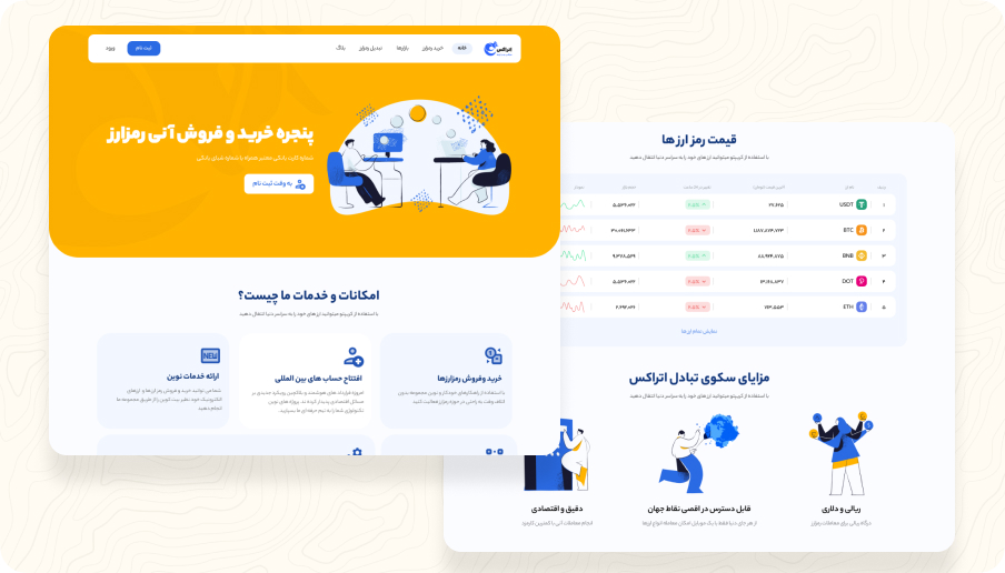
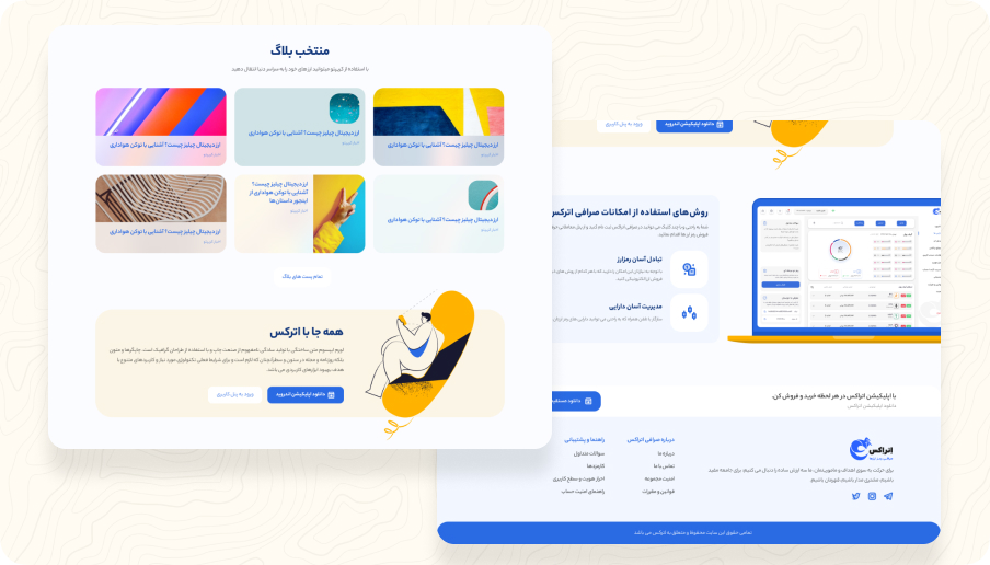
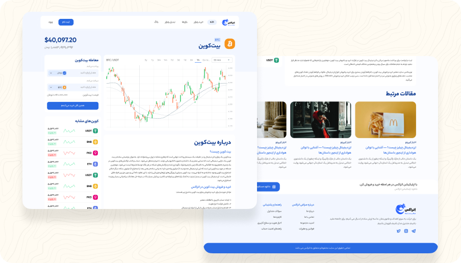
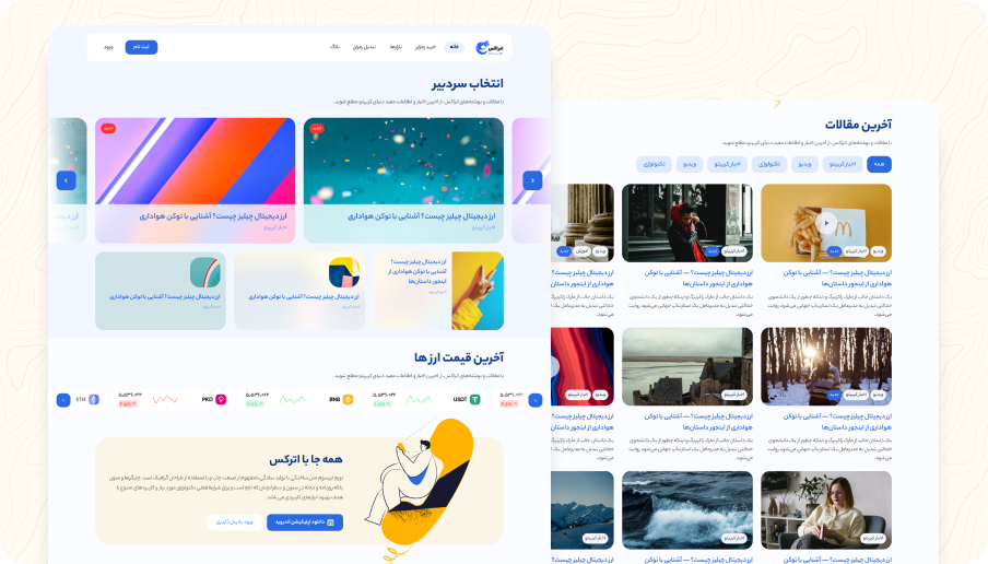
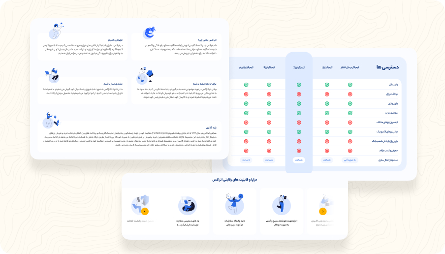
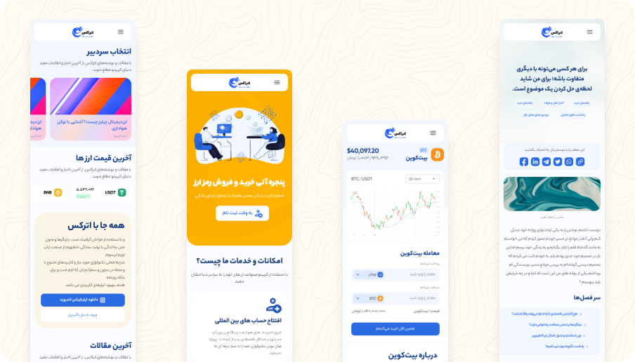
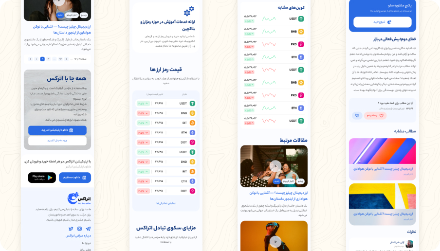
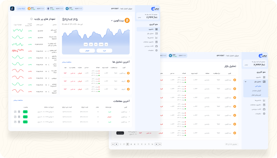
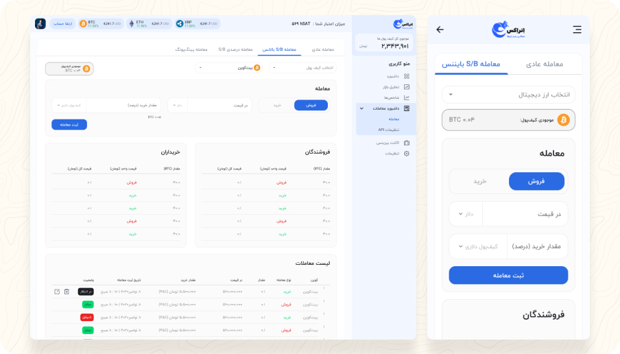
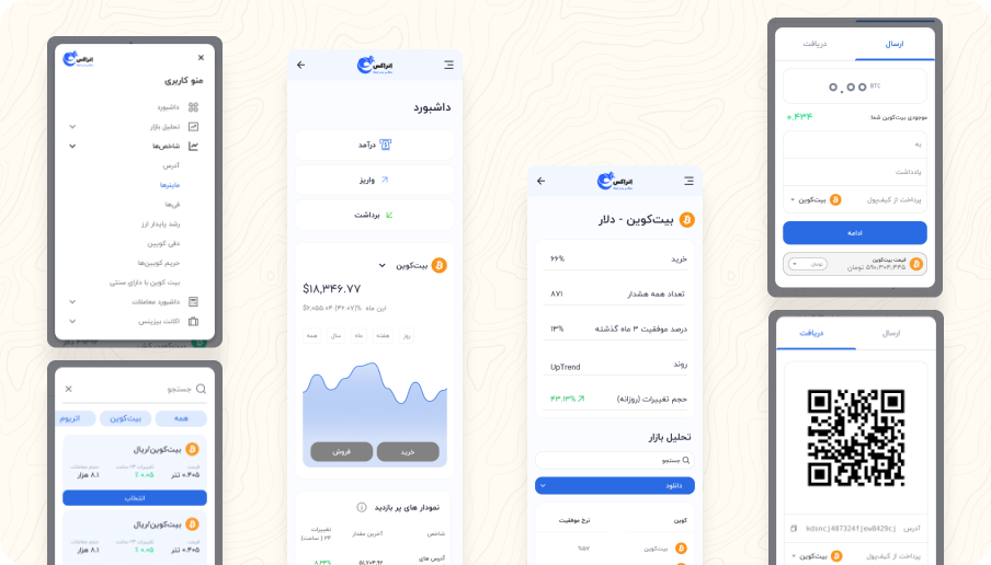
Owning the end-to-end design process
My responsibilities included conducting user research and analysis to identify user needs and pain points, defining user personas, creating wireframes, high-fidelity prototypes, and visual designs, as well as conducting user testing to validate design decisions and iterate on the product. Overall, my role was to ensure that the final product design was user-centered, visually appealing, technically feasible, and aligned with the company's goals and values.


Simplifying the complex: a user-friendly cryptocurrency trading platform
The cryptocurrency market is highly volatile and complex. The lack of simplicity and ease of use of existing platforms has made it difficult for novice traders to enter the market. Additionally, experienced traders have had to deal with the hassle of using multiple platforms to execute trades, which can be time-consuming and costly. Our platform aimed to solve these problems by offering an intuitive user interface, advanced tools, and a single platform to execute trades.
Our primary goal was to create a user-friendly platform that offered advanced trading tools. Additionally, we aimed to attract novice traders to the platform while retaining experienced traders. We believed that our platform could increase the number of traders in the market, contributing to the growth of the cryptocurrency industry as a whole.
Achieving user adoption and engagement
To measure the success of our design, we tracked these metrics:
User acquisition is a critical metric for any new platform, and for this startup, we set a goal of acquiring 1,000 registered users in the first month.
We tracked the number of trades executed on the platform. In the first month, we aimed to achieve at least 1,000 trades executed.
We tracked the overall trading volume on the platform. In the first month, we aimed to achieve $30,000 in trading volume.
we aimed for a retention rate of at least 50% after three months. This would demonstrate that users are finding value in the platform and are likely to continue using it in the future.
Finally, we also tracked user feedback through surveys and user testing. This allowed us to identify areas for improvement and make changes to the platform to better meet user needs.
From hurdles to solutions
Here are some of the main challenges we encountered and how we addressed them:
- Security: One of the biggest challenges in the cryptocurrency exchange market is security. Users need to feel confident that their assets are safe and protected from hackers and fraud. To address this challenge, we implemented multiple layers of security, including two-factor authentication, encryption, and secure storage of user data. We also conducted extensive testing to identify and fix any security vulnerabilities in the platform.
- User trust: Another challenge was building trust with users, particularly in a market that is known for scams and fraudulent activity. To address this challenge, we prioritized transparency and clear communication with users. We provided detailed information about the platform's security features and policies, as well as clear instructions for using the platform. We also provided reliable customer support to address any questions or concerns users had.
- Compliance: The cryptocurrency exchange market is highly regulated, and there are strict requirements for compliance with anti-money laundering (AML) and know-your-customer (KYC) regulations. To address this challenge, we implemented robust AML and KYC procedures and worked closely with legal experts to ensure compliance with all relevant regulations.
- User experience: Finally, we wanted to create a platform that was user-friendly and easy to navigate, even for users who were new to cryptocurrency trading. To address this challenge, we conducted extensive user testing and incorporated user feedback into the design and development process. We also prioritized simplicity and clarity in the platform's interface and provided clear instructions and guidance for users throughout the trading process.
By addressing these challenges head-on and prioritizing user needs and preferences throughout the design and development process, we were able to create a cryptocurrency exchange platform that was secure, user-friendly, and compliant with all relevant regulations.
A step-by-step process for a successful platform

One of the first steps we took was to conduct a thorough analysis of the existing cryptocurrency exchanges on the market. We examined the features, user interfaces, and user experiences of several leading exchanges to identify areas of strength and weakness. This research helped us gain a better understanding of the needs and preferences of cryptocurrency traders and informed our own design decisions.
Based on this research, we identified several key design goals for the exchange, including:
- Simple and intuitive user interface - To make it easy for users to buy, sell and exchange cryptocurrencies without any technical knowledge.
- Security - To ensure the platform is secure and protects user data and assets.
- Low transaction fees - To attract traders and compete with other exchanges in the market.
- High-speed transaction processing - To ensure quick and efficient trades.
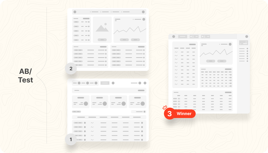
Next, we developed several design concepts for the platform, each with a different focus on the key features identified in our research. We created wireframes and user flows for each concept and conducted user testing to evaluate which concepts performed the best in terms of user experience and meeting user needs.
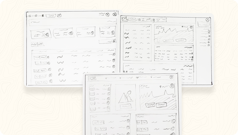
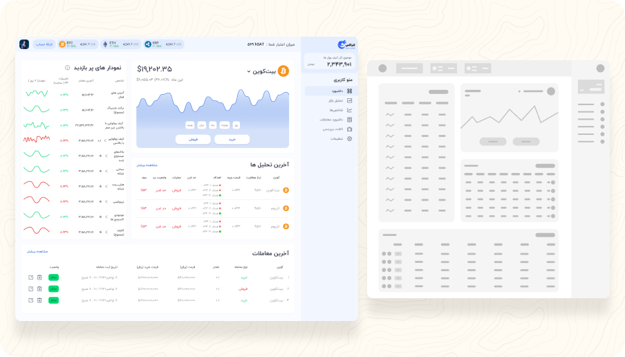
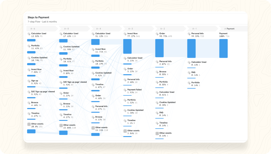
One of the key challenges we faced was balancing simplicity and functionality. We wanted to provide users with all the necessary information and tools for trading, while also keeping the interface simple and intuitive. To address this, we focused on creating a clear visual hierarchy and minimizing clutter.
Another challenge was ensuring the security of the platform. We implemented various security measures, such as two-factor authentication, encryption, and secure storage of user assets.
Based on the feedback from user testing and our analysis, we narrowed down the design concepts to two final options. We conducted further user testing on these options and gathered feedback on their performance in terms of usability, security, and overall user experience. Finally, we selected the best solution based on a combination of user feedback, our analysis, and the feasibility of implementation.
Overall, the design process involved a user-centred approach, iterative design, and careful consideration of design goals and user needs. By focusing on simplicity, functionality, and security, we were able to create an effective and user-friendly cryptocurrency exchange that met the needs of our target audience.
Researching User Needs
My research processes involved a mix of qualitative and quantitative methods. Here are some of the research activities that were conducted:
- User research: We conducted interviews and surveys with potential users to understand their needs, pain points, and behaviors related to cryptocurrency exchange.
- Competitive analysis: We analyzed the features and user experience of existing cryptocurrency exchange platforms to identify strengths, weaknesses, and opportunities.
- Market research: We conducted research on the cryptocurrency market to understand trends, regulations, and potential risks.
- Technical research: We conducted research on the technical aspects of cryptocurrency exchange, including security, scalability, and transaction speed.
- Design research: We explored different design patterns, user interface components, and visual styles that could be used to create a user-friendly and engaging cryptocurrency exchange platform.
- Data analysis: We analyzed data from our user research and user testing to identify patterns and insights that could inform our design decisions.
Iterative testing
The testing processes we followed were:
- User testing: We conducted user testing with a sample group of users to get feedback on the design and user flow. This helped us identify areas of the design that needed improvement, and we iterated on those based on user feedback.
- A/B testing: We conducted A/B testing to compare the performance of different variations of the design. We tested different layouts, button placements, and wording to determine the most effective design for our users.
- Usability testing: We conducted usability testing to ensure that the design was intuitive and easy to use. We tested the design with a sample group of users and asked them to perform specific tasks to see how easily they could complete them.
- Performance testing: We conducted performance testing to ensure that the design was fast and responsive. We tested the design under different conditions to ensure that it could handle different levels of traffic and usage.
- Security testing: We conducted security testing to ensure that the design was secure and that users' personal and financial information was protected.
More projects

 Divar
Divar
 Revivoto
 Rechat