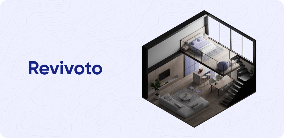
Designing an AI-based
image-processing platform
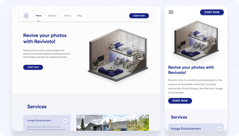
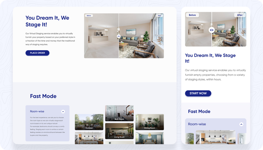
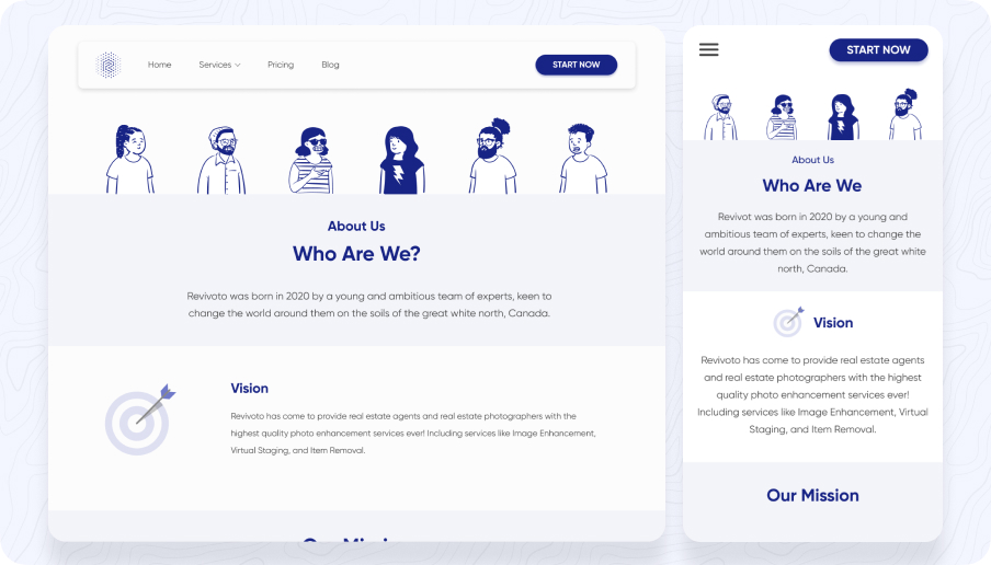
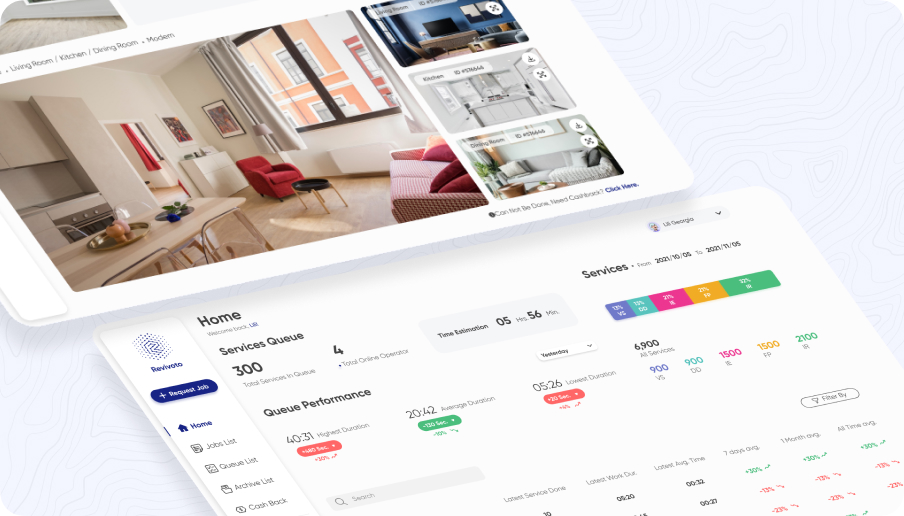
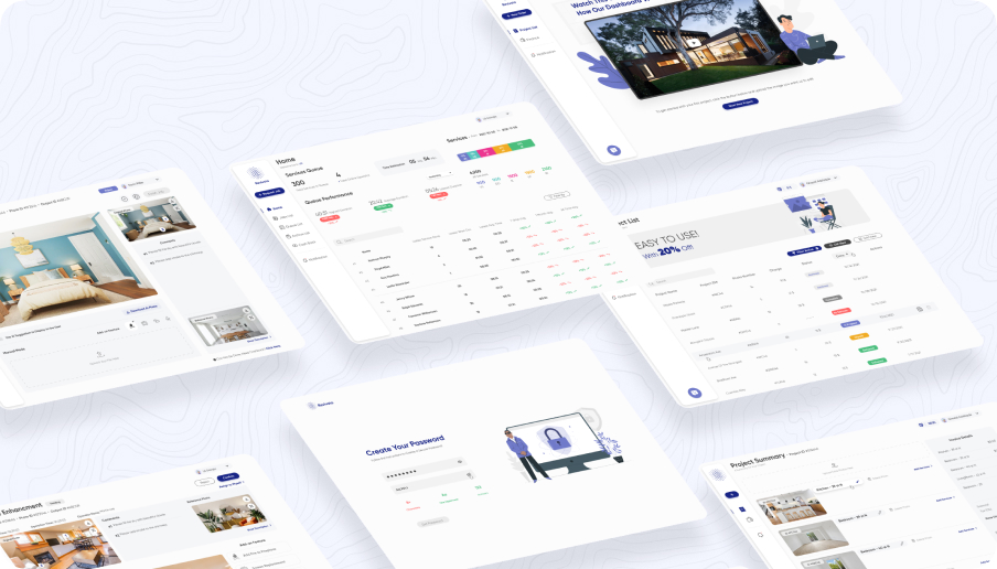
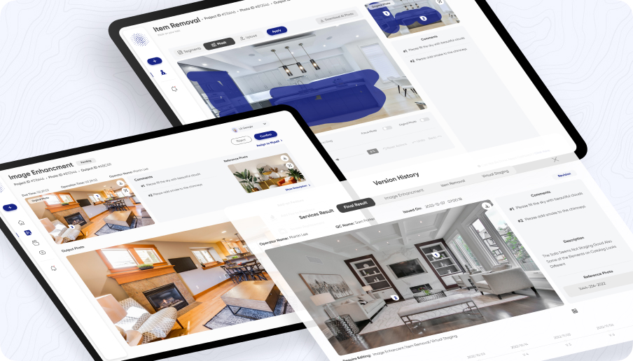
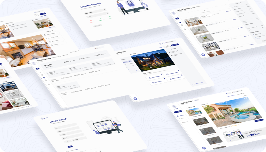
I led the design team of 5 people and worked as a product designer. Our objective was to design 5 different dashboards (Users and back-office users) for Revivoto.
 Revivoto
A product for an AI-based image-processing
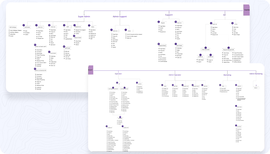
The Canadian startup, which specializes in AI-based image processing, wanted to develop a product that would cater to both end-users and back-office users. The end-users were individuals and businesses who wanted to edit and process their images, while the back-office users were employees who would manage and process large quantities of images. The primary target audience of the product was photographers, digital marketers, graphic designers, and e-commerce businesses.
Creating a design team and workflows
As the design leads on this project, my role was to oversee the entire design process from start to finish at the same time I worked as a product designer and I participated in all of the steps. I was responsible for managing the design team and ensuring that the final product met the client's needs and goals.


Streamlining image processing for End-users and Back-office administrators
We faced a problem where users were struggling to process and edit images quickly and efficiently. The existing image processing tools were either too complicated or lacked advanced features, resulting in users spending more time editing and processing images. Additionally, back-office users were struggling to manage and process a large number of images efficiently, resulting in slower turnaround times for their businesses. This problem was affecting the end-users' productivity and the back-office users' ability to deliver work efficiently.
Metrics for both side
Metrics are an important aspect of any product design project, and in this case, we had several metrics to track the success of the image-processing product for end-users and back-office users.
Our goal was to achieve a conversion rate of 30%, and we were able to achieve a rate of 35%.
Our goal was to achieve a retention rate of 50%, and we were able to achieve a rate of 55%.
On average, users spent 15 minutes on per session and processed an average of 20 images per session.
On a scale of 1-10, the average customer satisfaction score was 8.5.
On average, it took back-office users 50% less time to process images using the product compared to manual methods.
The error rate was less than 1%, and issues were resolved within an average of 10 minutes.
Our goal was to have at least 50% of back-office users adopt the product, and we were able to achieve a rate of 60%.
Our goal was to achieve cost savings of at least 30%, and we were able to achieve savings of 35%.
Overall, by tracking these metrics and achieving our goals, we were able to demonstrate the success of the image-processing product and the value it provided to both end-users and back-office users.
User-centric design vs technical feasibility
There were several challenges that we encountered during this case:
- The complexity of the product: Developing a product for both end-users and back-office users was a complex task. We needed to ensure that the product was user-friendly and intuitive for both types of users.
- Integration with AI: The product was based on AI technology, which required us to integrate various algorithms and data models. This was a technical challenge that required a lot of testing and iteration to get right.
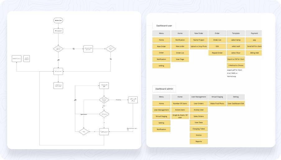
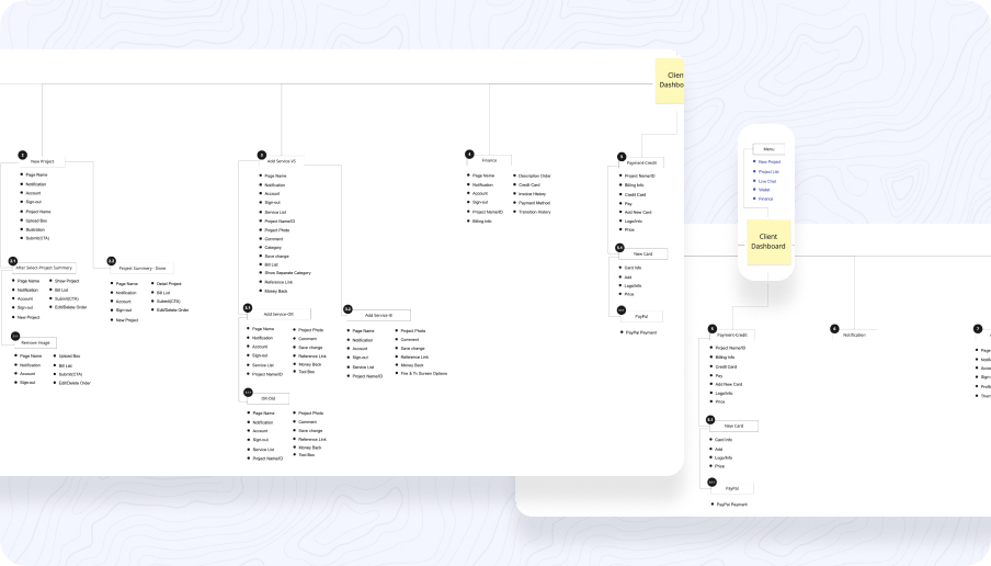
- Multiple dashboards: Designing four dashboards for back-office users and one dashboard for end-users was a challenging task. We needed to ensure that each dashboard had a unique user interface that was intuitive and easy to use.
A step-by-step approach to developing the solutions

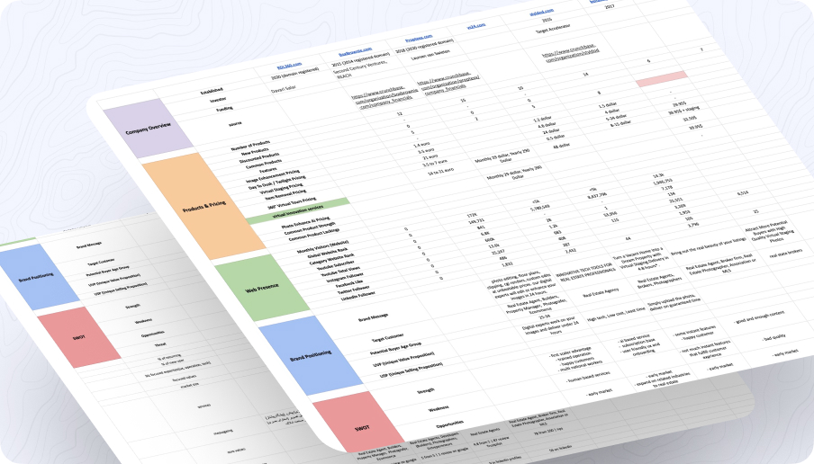
As the design lead for this project, the first step was to conduct a thorough analysis of the user needs and the current market. We reviewed competitor products and identified gaps in the market where our image-processing product could excel. Through user interviews and surveys, we gained insights into the key pain points and needs of both end-users and back-office users.
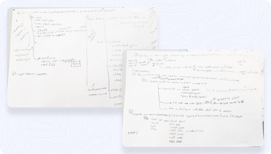
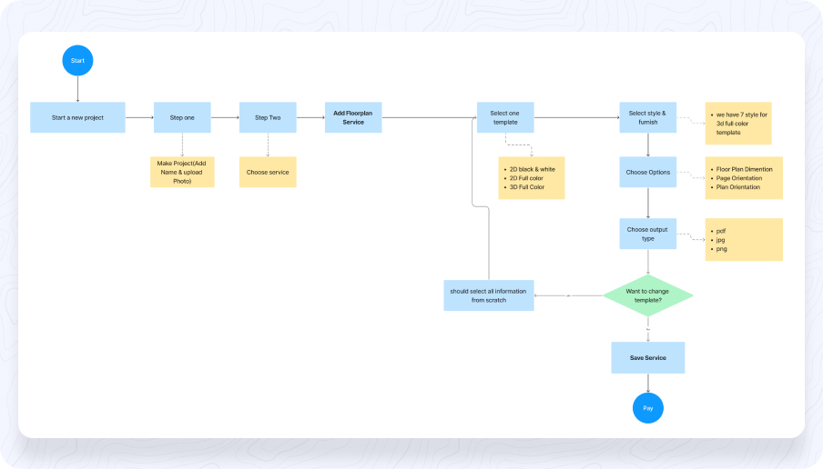
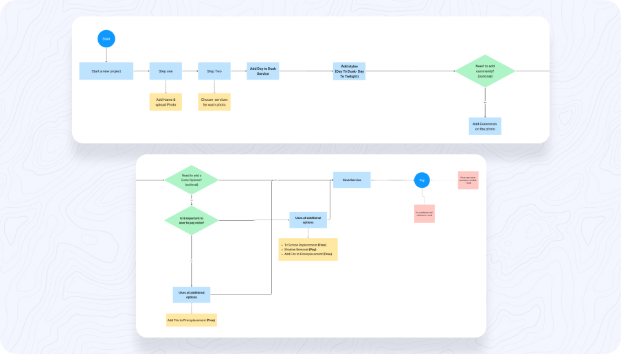
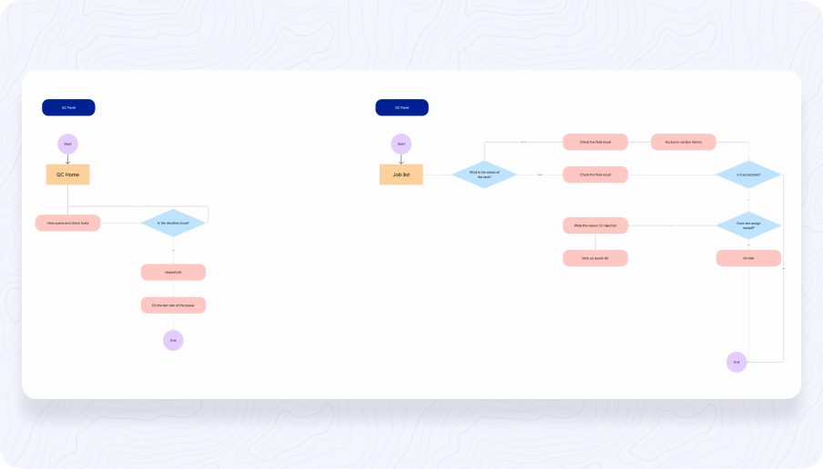
Based on these insights, we created user personas for each audience and mapped out their user journeys, identifying the key touchpoints and pain points in their experience. We then used this information to create user stories that helped guide our design decisions and ensure that we were creating a product that would truly meet their needs.
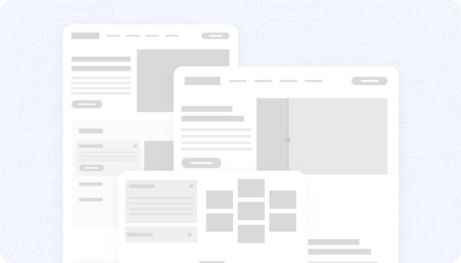
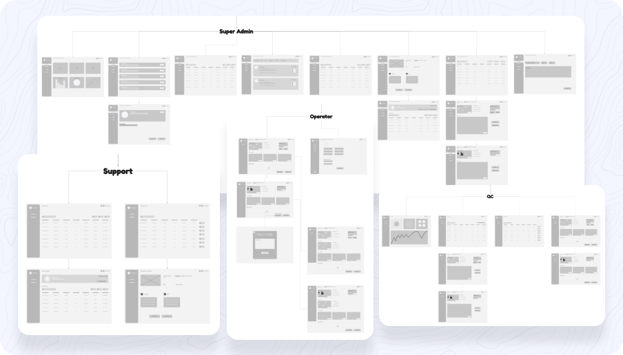
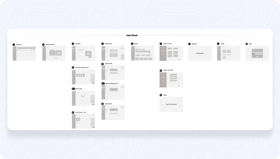
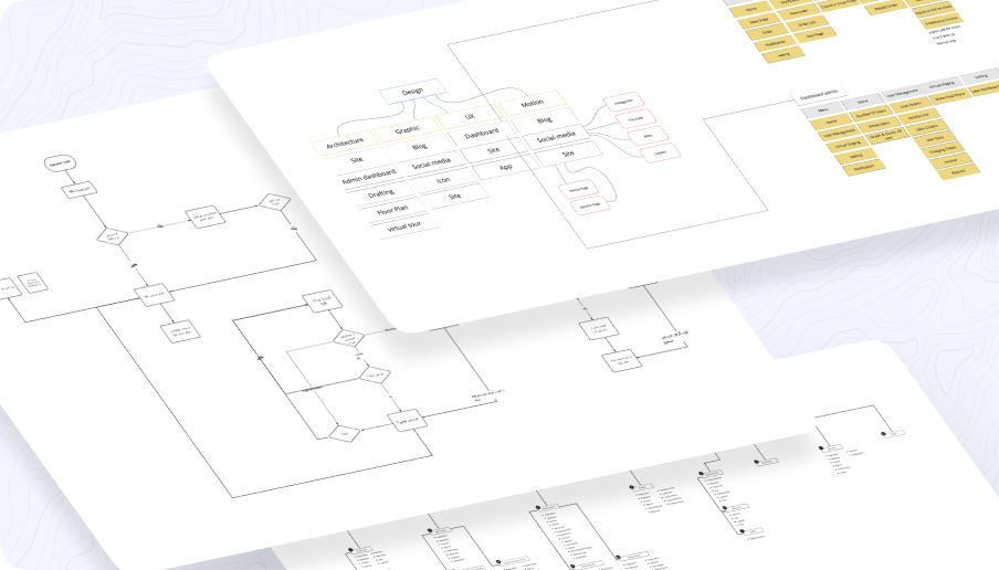
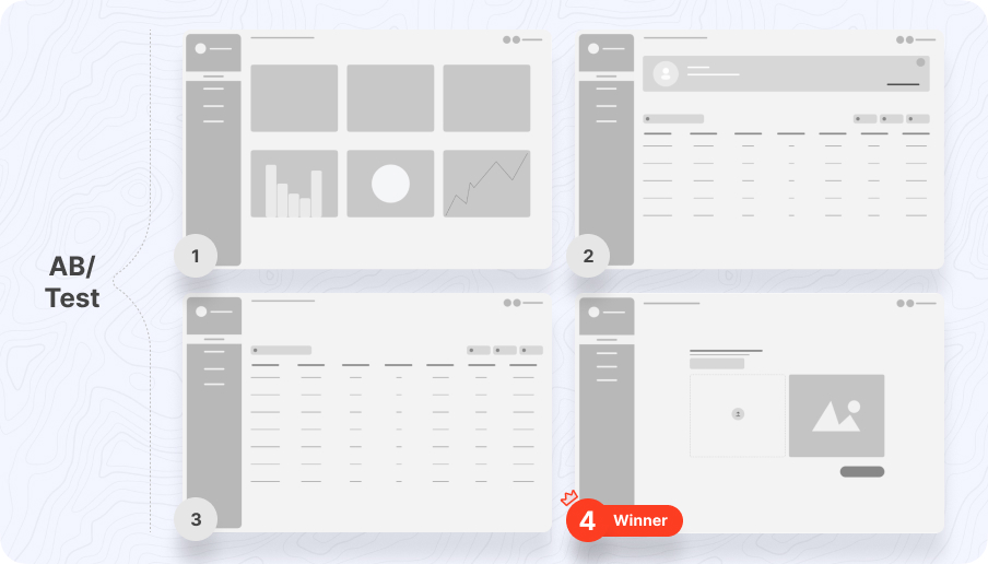
We created wireframes and low-fidelity prototypes to test and validate our initial design ideas with users. Based on their feedback, we refined our designs and moved into high-fidelity prototyping. We created multiple design options for each dashboard and tested them with users to identify the most effective layouts and features.
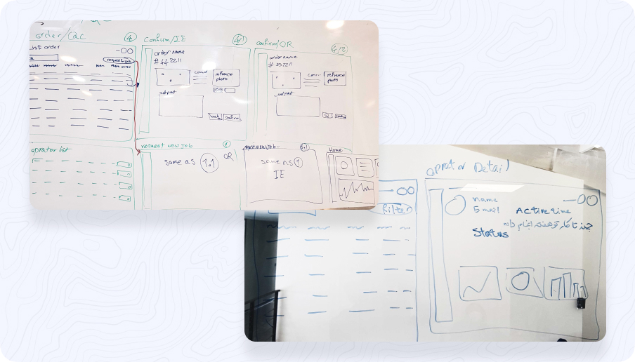
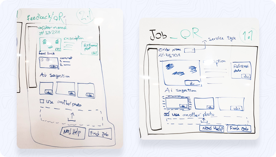
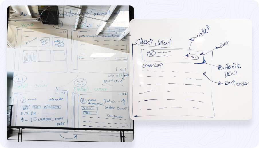
As we moved into the development phase, we continued to iterate on the design and make adjustments based on user feedback and our own analysis. We worked closely with the development team to ensure that the final product was not only visually appealing but also highly functional and easy to use.
To select the best design option, we used a combination of qualitative and quantitative data. Qualitative data included user feedback gathered during user testing sessions and surveys. Quantitative data included metrics such as task completion rates and time on task. We used these metrics to compare the performance of different design options and identify the most effective one.
Overall, the design process was highly iterative and focused on meeting the needs of our target audience. By using a combination of user research, prototyping, and testing, we were able to create a product that truly met the needs of both end-users and back-office users.
Uncovering key insights for designing an image processing dashboard
- Define the problem: We first identified the problem that needed to be solved, which was the need for a user-friendly image processing product based on AI that could cater to both end-users and back-office users.
- User research: We conducted extensive user research to understand the needs, pain points, and preferences of both end-users and back-office users. This involved user interviews, surveys, and usability testing.
- Competitor analysis: We also conducted a thorough analysis of competing products in the market to identify the strengths and weaknesses of these products and to identify any gaps that could be addressed by our product.
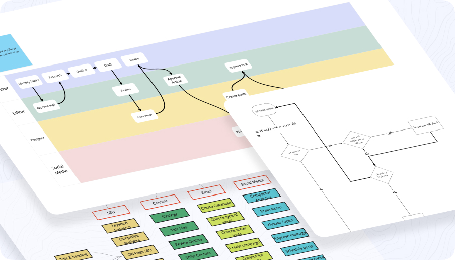
- Feature prioritization: Based on the user research and competitor analysis, We prioritized the features that needed to be included in the product and created user stories and user flows.
- Prototyping and testing: We created wireframes and interactive prototypes to test the product with users and to iterate on the design based on user feedback.
Throughout the design process, We kept the user at the center of the design, and We continuously iterated on the design based on user feedback and testing.

Professional photographers
These users need a tool that helps them quickly and easily process large quantities of photos. They require a high level of accuracy and control over their editing process.

Digital marketers
These users are looking for a tool that can help them create visually appealing content for their marketing campaigns. They require a fast and efficient way to edit images and need access to a variety of editing features.

Graphic designers
These users require advanced image editing tools to create visually stunning designs. They need a tool that can handle complex editing tasks and can integrate with other design software.

E-commerce businesses
These users need a tool that can help them quickly and easily edit product images for their online store. They require a fast and efficient way to edit images in bulk and need access to features like background removal and image resizing.
We conducted qualitative research to gain a deeper understanding of the needs and behaviors of our target audience. This involved conducting user interviews, contextual inquiries, and other forms of user research to collect rich, descriptive data about our users.
During this process, We developed hypotheses about our users' pain points, goals, and behaviors, which helped to guide further research and design decisions. For example, one hypothesis we developed was that our users needed a more efficient way to manage large numbers of images, which guided our decision to design dashboards for back-office users.
We utilized George Box's iterative learning process in this case study to continuously refine and improve our product design. This process involves several steps, including:
- Formulating a hypothesis: We started by formulating a hypothesis based on our initial research and insights. This hypothesis helped guide our design decisions and set a baseline for evaluating the effectiveness of our design.
- Designing experiments: Next, we designed experiments to test our hypothesis. This involved selecting key metrics to measure, defining our target audience, and determining the best way to collect data.
- Collecting data: We collected both qualitative and quantitative data through a variety of methods, including user surveys, interviews, and A/B testing. This data helped us understand how users were interacting with our product and identify areas for improvement.
- Analyzing results: After collecting data, we analyzed the results to determine if our hypothesis was supported or refuted. We used statistical analysis to identify trends and patterns in the data and draw conclusions.
- Refining the hypothesis: Based on our analysis, we refined our hypothesis and made adjustments to our design. We then repeated the process, continually refining and improving our design based on new data and insights.
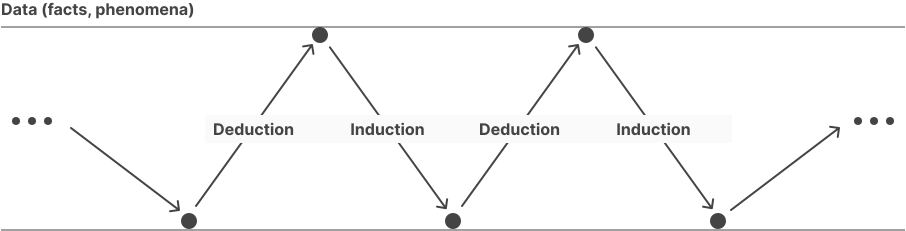
By using George Box's iterative learning process, we were able to create a product that was highly effective and met the needs of our target audience. This process allowed us to continuously improve our design based on real-world data and insights, resulting in a product that was both user-friendly and highly successful.
Going beyond UX heuristics
We conducted user testing to evaluate the effectiveness of our proposed design solutions. We designed and developed a prototype that included the new features and improvements based on our research insights.
The testing was conducted with a group of 10 users who matched our identified user personas. We used a combination of qualitative and quantitative methods to measure the effectiveness of our solutions. The testing was conducted in a controlled environment with a moderator present to guide the participants through the tasks.
The testing was conducted in two phases. In the first phase, we conducted a usability test to evaluate the ease of use and functionality of the new features. We asked participants to perform specific tasks using the prototype while recording their interactions and collecting feedback.
In the second phase, we conducted a satisfaction survey to gather quantitative data on the user's overall experience and satisfaction with the new features. We used a Likert scale to measure the participant's level of agreement with various statements related to the new features, such as "I found the new feature helpful" or "The new feature was easy to use."
The results of our testing were analyzed to identify areas for further improvement and to validate the effectiveness of our proposed solutions. The qualitative data collected from the usability test was coded and analyzed to identify common pain points and areas where the design could be improved. The quantitative data collected from the satisfaction survey was analyzed using statistical software to identify any trends or patterns.
Overall, the testing helped us to refine and validate our proposed solutions, ensuring that we were addressing the identified user needs effectively. The feedback and insights gathered from the testing were used to further iterate on the design solutions and ensure that they met the needs of the users.
More projects
 Rechat
 Eterex
 Divar
Divar